Welcome to my first post!
Hello to the deaf ears of nobody
I don't know why people create their own "blogs". The days of people checking out your website to see what changed have long gone. But I'm not doing this for anyone, except for myself. Which is the best reason that you can have to do anything!
I often have many things to say about something I did, but I have noone to say them to. I could put them into a video, but that's hard. I have other video projects that keep me busy and trying to do a quick, no effort video, was never a working strategy for me
About this website
To start off, let me talk about this website. Something something "I hate modern souless internet", but while making my own websites, I always kept falling into the same patterns as everyone else. But what would you expect, when the only point of reference is the thing you dislike
One day (which is the day of writing this post), I started talking to myself, explaining what I did today (happens more often than you would expect) and that's where the idea of creating a website came from. I always wanted to join indie web, but never had an idea. Today... I also didn't have an idea, which is the best kind of idea
On indie web, there are a lot of people trying to recreate the style of the early internet, just for the sake of nostalgia. Now, I get it. I also like it. But this makes indie web look more like a return to the past, than a new step forward. This is why my website looks like this. It's not trying to style everything that it can or throw a bunch of gifs for the sake of it. It's a simple, readable website with a bit of my own character
I mainly wanted form over function. I don't want no interactions, no animations no nothing. After all, the web was originally supposed to be structured more like a document. So it was settled: a box and a text. As you can imagine, that was incredibly boring. So I decided to style it a bit with shadows, gradients and formatting
Indenting
One of the most important thing I always implement to improve readibility is indenting. Here, you can see it in action:
Header
Header 2
Header 3
Header 4
Header 5
Header 6
Paragraph
I always imagine websites (especially blog ones like this one) as a tree with sub-sections. This is probably what they are supposed to be, but that gets often lost with the default html formatting
Navigation
On the very top you can see the navigation bar. It's nothing special, except that it's offset slightly to the right. This isn't a stylistic choice, I just had to make space for my computer's clock
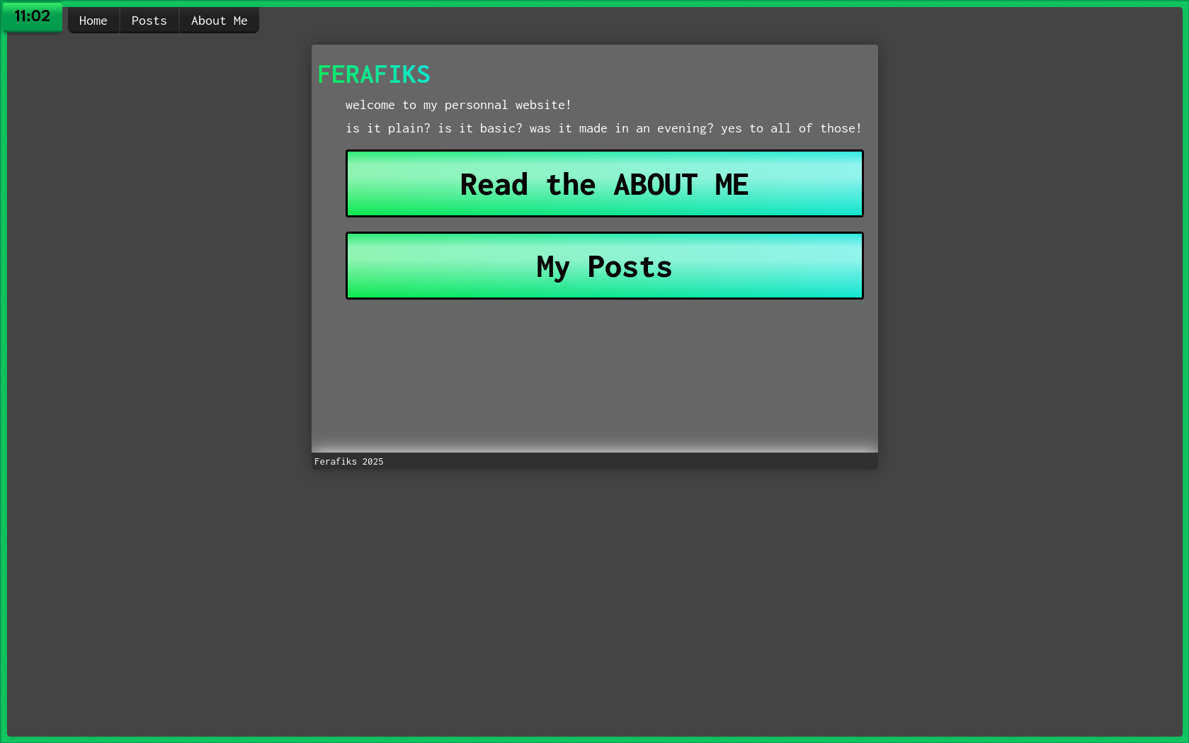
Instead of using a bar for showing information about my computer (e.g. time, volume, etc.) I use a floating clock widget, which reveals a bar containing additional information when clicked (or when I press the super key). I prefer it, because it gives me more screen space on my laptop, but it can get a bit annoying. I apply custom styles to websites and apps (by apps I only mean discord) to create a bit of space for it. I also have a shortcut to hide it when it starts getting too much in the way

Having my website not support this setup wouldn't be a big problem, but since it's my website, then I'll do what I want to do!
Generation
The website is using 11ty to generate .html files from markdown. The tempalte files are made in nunjucks (html with generaiton), but every page you see is just markdown. Why? Markdown is easier to work with and since I want function over form, it does the job
Gradients
Why are we so gradient-fobic these days? On this site, you can see this green-blue gradient being applied in a lot of places, but my favourite part is probably the navigation bar. With gradients, I made it look more like a physical button. I know, scary. I see this being often done in video games (scrap mechanic, satisfactory), but not really on websites anymore, or even apps. That's why I keep filling my desktop with a bunch of 3d-like styling (at least where I can, because even hyprland doesn't expect you to have gradients that are more than 2 colors)